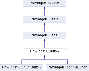
A button for initiating an action. More...
#include <Button.h>
Classes | |
| struct | ArgColor |
Contains resource IDs for arguments of type PgColor_t. More... | |
| struct | ArgPImage |
Contains resource IDs for arguments of type PhImage_t. More... | |
| struct | Arguments |
| Contains resource IDs for all Button arguments. More... | |
| struct | ArgUnsignedChar |
| Contains resource IDs for arguments of type unsigned char. More... | |
| struct | ThisArgs |
| Contains resource IDs for Button arguments. More... | |
Public Member Functions | |
| Button (int abn) | |
| (constructor) | |
| Button (PtWidget_t *wdg) | |
| (constructor) | |
| Button (const Button &other) | |
| (copy constructor) | |
| Button & | operator= (const Button &other) |
| Assigns value in Button widget. | |
 Public Member Functions inherited from PhWidgets::Label Public Member Functions inherited from PhWidgets::Label | |
| Label (int abn) | |
| (constructor) | |
| Label (PtWidget_t *wdg) | |
| (constructor) | |
| Label (const Label &other) | |
| (copy constructor) | |
| Label & | operator= (const Label &other) |
| Assigns value in Label widget. | |
| Public Member Functions inherited from PhWidgets::Basic | |
| Basic (int abn) | |
| (constructor) | |
| Basic (PtWidget_t *wdg) | |
| (constructor) | |
| Basic (const Basic &other) | |
| (copy constructor) | |
| Basic & | operator= (const Basic &other) |
| Assigns value in Basic widget. | |
| void | OnActivated (PtCallbackInfo_t *info) |
| Raises the Basic::Activate event. | |
| void | OnArmed (PtCallbackInfo_t *info) |
| Raises the Basic::Arm event. | |
| void | OnDisarmed (PtCallbackInfo_t *info) |
| Raises the Basic::Disarm event. | |
| void | OnGotFocused (PtCallbackInfo_t *info) |
| Raises the Basic::GotFocus event. | |
| void | OnLostFocus (PtCallbackInfo_t *info) |
| Raises the Basic::LostFocus event. | |
| void | OnMenu (PtCallbackInfo_t *info) |
| Raises the Basic::Menu event. | |
| void | OnRepeat (PtCallbackInfo_t *info) |
| Raises the Basic::Repeat event. | |
| Public Member Functions inherited from PhWidgets::Widget | |
| Widget (int abn) | |
| (constructor) | |
| Widget (PtWidget_t *wdg) | |
| (constructor) | |
| Widget (const Widget &other) | |
| (copy constructor) | |
| void | swap (Widget &other) |
| Exchanges the contents of *this and other. | |
| Widget & | operator= (const Widget &other) |
| Assigns value in Widget. | |
| Widget & | operator= (PtWidget_t *wdg) |
| Assigns value in Widget. | |
| bool | operator== (const Widget &other) const |
| Compares Widgets. | |
| bool | operator!= (const Widget &other) const |
| Compares Widgets. | |
| bool | operator< (const Widget &other) const |
| Compares Widgets. | |
| bool | operator<= (const Widget &other) const |
| Compares Widgets. | |
| bool | operator> (const Widget &other) const |
| Compares Widgets. | |
| bool | operator>= (const Widget &other) const |
| Compares Widgets. | |
| PtWidget_t * | get () const |
| Returns the stored pointer. | |
| operator PtWidget_t * () | |
| Converts Widget to Photon widget pointer. | |
| operator const PtWidget_t * () const | |
| Converts Widget to constant Photon widget pointer. | |
| void | BringToFront () |
| Brings the widget to the front of the z-order. | |
| bool | Contains (const Widget &widget) |
| Retrieves a value indicating whether the specified widget is a child of the widget. | |
| bool | Focus () |
| Sets input focus to the widget. | |
| Widget | GetNextWidget (const Widget &widget, bool forward=true) const |
| Retrieves the next widget forward or back in the tab order of child widgets. | |
| void | Hide () |
| Conceals the widget from the user. | |
| void | Invalidate (PhRect_t rc, bool invalidateChildren=false) |
| Invalidates a specific region of the widget and causes a paint message to be sent to the widget. | |
| void | Invalidate (bool invalidateChildren=false) |
| Invalidates a specific region of the widget and causes a paint message to be sent to the widget. | |
| bool | Realize () |
| Make the widget and its children visible and possibly interactive. | |
| void | Refresh () |
| Forces the widget to invalidate its client area and immediately redraw itself and any child widgets. | |
| void | SendToBack () |
| Sends the widget to the back of the z-order. | |
| void | SetBounds (short x, short y, unsigned short width, unsigned short height) |
| Sets the bounds of the widget to the specified location and size. | |
| void | SetBounds (short x, short y) |
| Sets the bounds of the widget to the specified location. | |
| void | Select () |
| Activates the widget. | |
| void | Show () |
| Displays the widget to the user. | |
| bool | Unrealize () |
| Unrealizes the widget and all its children. | |
| void | OnDestroyed (PtCallbackInfo_t *info) |
| Raises the Widget::Destroyed event. | |
| void | OnBlocked (PtCallbackInfo_t *info) |
| Raises the Widget::Blocked event. | |
| void | OnDragDrop (PtCallbackInfo_t *info) |
| Raises the Widget::DragDrop event. | |
| void | OnOutbound (PtCallbackInfo_t *info) |
| Raises the Widget::Outbound event. | |
| void | OnRealized (PtCallbackInfo_t *info) |
| Raises the Widget::Realized event. | |
| void | OnUnrealized (PtCallbackInfo_t *info) |
| Raises the Widget::Unrealized event. | |
Public Attributes | |
| WidgetResourcesSingleton | resource |
| Resources of the Button. | |
Properties | |
Properties are used to simplify use of widget resources. | |
| phproperty< Drawing::Color >::bind< Button, ArgColor::eArgColor, Arguments::arm_color > | ArmColor |
| Gets or sets the color of the widget when the Button is armed (pressed in). | |
| phproperty< bool >::bind< Button, ArgUnsignedChar::eArgUnsignedChar, Arguments::arm_fill > | ArmFill |
| Determines whether or not to use Button::ArmColor as the background color when the Button is armed (pressed in). | |
| Public Attributes inherited from PhWidgets::Label | |
| WidgetResourcesSingleton | resource |
| Resources of the Label. | |
| property< Drawing::Image >::bind< Label, &Label::getImage, &Label::setImage > | Image |
| Gets or sets the Image associated with this widget. | |
| property< std::string >::bind< Label, &Label::getText, &Label::setText > | Text |
| Gets or sets the text associated with this widget. | |
| property< Drawing::Font >::bind< Label, &Label::getFont, &Label::setFont > | Font |
| Gets or sets the font of the text displayed by the widget. | |
| phproperty< Drawing::Color >::bind< Label, ArgColor::eArgColor, Arguments::balloon_color > | BalloonColor |
| Gets or sets the balloon color of the Label. | |
| phproperty< Drawing::Color >::bind< Label, ArgColor::eArgColor, Arguments::balloon_fill_color > | BalloonFillColor |
| Gets or sets the balloon fill color of the Label. | |
| property< PhWidgets::BalloonPosition::eBalloonPosition >::bind< Label, &Label::getBalloonPosition, &Label::setBalloonPosition > | BalloonPosition |
| Gets or sets where the balloon with the label's text pops up. | |
| property< Drawing::ContentAlignment::eContentAlignment >::bind< Label, &Label::getTextAlign, &Label::setTextAlign > | TextAlign |
| Gets or sets the alignment of text in the label. | |
| property< Drawing::ContentAlignment::eContentAlignment >::bind< Label, &Label::getTextClippedAlign, &Label::setTextClippedAlign > | TextClippedAlign |
| Gets or sets the alignment of text in the label if the text string is clipped. | |
| property< PhWidgets::LabelType::eLabelType >::bind< Label, &Label::getType, &Label::setType > | Type |
| Gets or sets the type of information displayed by the Label. | |
| phproperty< Drawing::Color >::bind< Label, ArgColor::eArgColor, Arguments::underline1 > | UnderlineColor1 |
| Gets or sets the underline color for the first line of the Label. | |
| phproperty< Drawing::Color >::bind< Label, ArgColor::eArgColor, Arguments::underline2 > | UnderlineColor2 |
| Gets or sets the underline color for the second line of the Label. | |
| property< PhWidgets::UnderlineType::eUnderlineType >::bind< Label, &Label::getUnderlineType, &Label::setUnderlineType > | UnderlineType |
| Gets or sets the type of underline. | |
| Public Attributes inherited from PhWidgets::Basic | |
| WidgetResourcesSingleton | resource |
| Resources of the Basic. | |
| phproperty< Drawing::Color >::bind< Basic, Arguments< PgColor_t >::ColorResource, Arguments<>::BevelColor > | BevelColor |
| Gets or sets the main color of the bevel. | |
| phproperty< Drawing::Color >::bind< Basic, Arguments< PgColor_t >::ColorResource, Arguments<>::DrawingColor > | Color |
| Gets or sets the foreground or drawing color for the widget. | |
| phproperty< Drawing::Color >::bind< Basic, Arguments< PgColor_t >::ColorResource, Arguments<>::DarkBevelColor > | DarkBevelColor |
| Gets or sets the dark outermost color used when applying a bevel to a widget. | |
| phproperty< Drawing::Color >::bind< Basic, Arguments< PgColor_t >::ColorResource, Arguments<>::DarkFillColor > | DarkFillColor |
| Gets or sets the dark color with which a gradient (if applied) goes. | |
| phproperty< Drawing::Color >::bind< Basic, Arguments< PgColor_t >::ColorResource, Arguments<>::FillColor > | FillColor |
| Gets or sets the fill color for the widget. | |
| phproperty< Drawing::Color >::bind< Basic, Arguments< PgColor_t >::ColorResource, Arguments<>::InlineColor > | InlineColor |
| Gets or sets the color of the inline of the border. | |
| phproperty< Drawing::Color >::bind< Basic, Arguments< PgColor_t >::ColorResource, Arguments<>::LightBevelColor > | LightBevelColor |
| Gets or sets the light outermost color used when applying a bevel to a widget. | |
| phproperty< Drawing::Color >::bind< Basic, Arguments< PgColor_t >::ColorResource, Arguments<>::LightFillColor > | LightFillColor |
| Gets or sets the light color with which a gradient (if applied) goes. | |
| phproperty< unsigned short >::bind< Basic, Arguments< unsigned short >::Scalar, Arguments<>::MarginHeight > | MarginHeight |
| Gets or sets the amount of vertical space between the widget's canvas and the widget's border. | |
| phproperty< unsigned short >::bind< Basic, Arguments< unsigned short >::Scalar, Arguments<>::MarginWidth > | MarginWidth |
| Gets or sets the amount of horizontal space between the widget's canvas and the widget's border. | |
| phproperty< Drawing::Color >::bind< Basic, Arguments< PgColor_t >::ColorResource, Arguments<>::OutlineColor > | OutlineColor |
| Gets or sets the color of the outline of the border. | |
| phbitmask< unsigned long, Flags::Basic::type >::bind< Basic, Arguments< unsigned long >::Scalar, Arguments<>::BasicFlags > | BasicFlags |
| Gets or sets basic flags inherited by all widgets. See Flags::Basic::type. | |
| phwidgets_event< Basic, Basic::Callbacks<>::Activate > | Activate |
| Occurs when you release the left pointer button while pointing at an armed widget. | |
| phwidgets_event< Basic, Basic::Callbacks<>::Arm > | Arm |
| Occurs when you press the left pointer button while pointing at the widget. | |
| phwidgets_event< Basic, Basic::Callbacks<>::Disarm > | Disarm |
| Occurs when you release the left pointer button when not pointing at an armed widget. | |
| phwidgets_event< Basic, Basic::Callbacks<>::GotFocus > | GotFocus |
| Occurs when a widget gets focus or its focus status changes. | |
| phwidgets_event< Basic, Basic::Callbacks<>::LostFocus > | LostFocus |
| Occurs when a widget loses focus. | |
| phwidgets_event< Basic, Basic::Callbacks<>::Menu > | Menu |
| Occurs when you press the right button while the pointer is on top of the widget. | |
| phwidgets_event< Basic, Basic::Callbacks<>::Repeat > | Repeat |
| Documentation in progress... | |
| Public Attributes inherited from PhWidgets::Widget | |
| WidgetResourcesSingleton | resource |
| Resources of the Widget. | |
| property< bool >::bind< Widget, &Widget::getAllowDrop, &Widget::setAllowDrop > | AllowDrop |
| Gets or sets a value indicating whether the widget can accept data that the user drags onto it. | |
| phbitmask< unsigned, Flags::Anchor::type, Flags::Anchor::All >::bind< Widget, Arguments< unsigned >::Flag, Arguments< unsigned >::AnchorFlags > | Anchor |
| Gets or sets flags specifying how the widget is anchored to its parent. | |
| phproperty< unsigned short >::bind< Widget, Arguments< unsigned short >::Scalar, Arguments< unsigned short >::BevelWidth > | BevelWidth |
| Gets or sets the bevel width of the widget. | |
| property< short, property<>::ro >::bind< Widget, &Widget::getBottom > | Bottom |
| Gets the distance, in pixels, between the bottom edge of the widget and the top edge of its container's client area. | |
| property< PhArea_t >::bind< Widget, &Widget::getBounds, &Widget::setBounds > | Bounds |
| Gets or sets the size and location of the widget including its nonclient elements, in pixels, relative to the parent widget. | |
| property< bool, property<>::ro >::bind< Widget, &Widget::getCanFocus > | CanFocus |
| Gets a value indicating whether the widget can receive focus. | |
| property< bool, property<>::ro >::bind< Widget, &Widget::getCanSelect > | CanSelect |
| Gets a value indicating whether the widget can be selected. | |
| property< bool, property<>::ro >::bind< Widget, &Widget::getContainsFocus > | ContainsFocus |
| Gets a value indicating whether the widget, or one of its child widgets, currently has the input focus. | |
| property< PhWidgets::Cursor >::bind< Widget, &Widget::getCursor, &Widget::setCursor > | Cursor |
| Gets or sets the cursor that is displayed when the mouse pointer is over the widget. | |
| phproperty< Drawing::Color >::bind< Widget, Arguments< PgColor_t >::Color, Arguments< PgColor_t >::CursorColor > | CursorColor |
| Gets or sets the color of the cursor pointer when it's inside the widget. | |
| property< bool >::bind< Widget, &Widget::getEnabled, &Widget::setEnabled > | Enabled |
| Gets or sets a value indicating whether the widget can respond to user interaction. | |
| property< bool, property<>::ro >::bind< Widget, &Widget::getFocused > | Focused |
| Gets a value indicating whether the widget has input focus. | |
| property< bool, property<>::ro >::bind< Widget, &Widget::hasChildren > | HasChildren |
| Gets a value indicating whether the widget contains one or more child widgets. | |
| property< bool, property<>::ro >::bind< Widget, &Widget::hasParent > | HasParent |
| Gets a value indicating whether the widget has parent. | |
| phproperty< unsigned short >::bind< Widget, Arguments< unsigned short >::Scalar, Arguments< unsigned short >::Height > | Height |
| Gets or sets the height of the widget. | |
| property< std::string >::bind< Widget, &Widget::getHelpTopic, &Widget::setHelpTopic > | HelpTopic |
| Gets or sets the help topic of the widget. | |
| property< bool, property<>::ro >::bind< Widget, &Widget::getIsRealized > | IsRealized |
| Gets or sets a value indicating whether the widget is realized. | |
| property< short >::bind< Widget, &Widget::getLeft, &Widget::setLeft > | Left |
| Gets or sets the distance, in pixels, between the left edge of the widget and the left edge of its container's client area. | |
| property< PhPoint_t >::bind< Widget, &Widget::getLocation, &Widget::setLocation > | Location |
| Gets or sets the coordinates of the upper-left corner of the widget relative to the upper-left corner of its container. | |
| property< PtWidget_t * >::bind< Widget, &Widget::getParent, &Widget::setParent > | Parent |
| Gets or sets the parent container of the widget. | |
| phproperty< PhPoint_t >::bind< Widget, Arguments< PhPoint_t >::Struct, Arguments< PhPoint_t >::Position > | Position |
| Gets or sets the absolute coordinates of the upper-left corner of the widget. | |
| property< short, property<>::ro >::bind< Widget, &Widget::getRight > | Right |
| Gets the distance, in pixels, between the right edge of the widget and the left edge of its container's client area. | |
| phproperty< PhDim_t >::bind< Widget, Arguments< PhDim_t >::Struct, Arguments< PhDim_t >::Dimension > | Size |
| Gets or sets the size of the widget. | |
| tag_property< Widget, &Widget::getTag, &Widget::setTag > | Tag |
| Gets or sets the resource that contains data about the widget. | |
| property< short >::bind< Widget, &Widget::getTop, &Widget::setTop > | Top |
| Gets or sets the distance, in pixels, between the top edge of the widget and the top edge of its container's client area. | |
| property< bool >::bind< Widget, &Widget::getVisible, &Widget::setVisible > | Visible |
| Gets or sets a value indicating whether the widget and all its child widgets are displayed. | |
| property< std::set< PhWidgets::Widget >, property<>::ro >::bind< Widget, &Widget::getWidgets > | Widgets |
| Gets the list of widgets contained within the widget. | |
| phproperty< unsigned short >::bind< Widget, Arguments< unsigned short >::Scalar, Arguments< unsigned short >::Width > | Width |
| Gets or sets the width of the widget. | |
| phbitmask< unsigned long, Flags::Extended::type >::bind< Widget, Arguments< unsigned long >::Flag, Arguments< unsigned long >::ExtendedFlags > | ExtendedFlags |
| Gets or sets extended flags inherited by all widgets. See Flags::Extended::type. | |
| phbitmask< long, Flags::type >::bind< Widget, Arguments< long >::Flag, Arguments< long >::Flags > | WidgetFlags |
| Gets or sets flags inherited by all widgets. | |
| phbitmask< long, Flags::Resize::type >::bind< Widget, Arguments< long >::Flag, Arguments< long >::Resiztype > | Resiztype |
| Gets or sets flags to control a widget's resize policy. See Flags::Resize::type. | |
| phwidgets_event< Widget, Widget::Callbacks<>::Destroyed > | Destroyed |
| Occurs when the widget is destroyed. | |
| phwidgets_event< Widget, Widget::Callbacks<>::Blocked > | Blocked |
| Occurs when the widget is blocked. | |
| phwidgets_event< Widget, Widget::Callbacks<>::DragAndDrop > | DragDrop |
| Occurs when a drag-and-drop operation is completed. | |
| phwidgets_event< Widget, Widget::Callbacks<>::IsDestroyed > | IsDestroyed |
| Occurs when the widget's resources are being released. | |
| phwidgets_event< Widget, Widget::Callbacks<>::Outbound > | Outbound |
| Occurs when you press the pointer button on the widget and then move out of the "hot spot" with the button still depressed. | |
| phwidgets_event< Widget, Widget::Callbacks<>::Realized > | Realized |
| Occurs when the widget is realized. | |
| phwidgets_event< Widget, Widget::Callbacks<>::Unrealized > | Unrealized |
| Occurs when the widget is unrealized. | |
Additional Inherited Members | |
| Public Types inherited from PhWidgets::Widget | |
| typedef phevent::ph_callback_t | callback_t |
| An event handler that is raised when an event occur. | |
| Static Public Member Functions inherited from PhWidgets::Widget | |
| static void | Update () |
| Causes the Photon microGUI to redraw the all invalidated regions. | |
Detailed Description
A button for initiating an action.
The Button class draws a button. Buttons let you initiate an action within your application; clicking a button invokes an application callback.
Constructor & Destructor Documentation
◆ Button() [1/3]
|
explicit |
(constructor)
Constructs a Button widget by ID.
- Parameters
-
[in] abn ID given by PhAB to widget (like 'ABN_WIDGET_NAME').
◆ Button() [2/3]
|
explicit |
(constructor)
Constructs a Button widget by pointer to widget.
- Parameters
-
[in] wdg pointer to Photon widget.
◆ Button() [3/3]
| PhWidgets::Button::Button | ( | const Button & | other | ) |
Member Function Documentation
◆ operator=()
Member Data Documentation
◆ ArmColor
| phproperty<Drawing::Color>::bind<Button, ArgColor::eArgColor, Arguments::arm_color> PhWidgets::Button::ArmColor |
Gets or sets the color of the widget when the Button is armed (pressed in).
Property Value
A Drawing::Color that represents the arm color of the widget.
- Remarks
- Color will change only if Button::ArmFill property is set to
true.
- See also
◆ ArmFill
| phproperty<bool>::bind<Button, ArgUnsignedChar::eArgUnsignedChar, Arguments::arm_fill> PhWidgets::Button::ArmFill |
Determines whether or not to use Button::ArmColor as the background color when the Button is armed (pressed in).
Property Value
bool
true if the Button::ArmColor is used; false if the Button::ArmColor is not used.
- See also
◆ resource
| WidgetResourcesSingleton PhWidgets::Button::resource |
Resources of the Button.
- See also
The documentation for this class was generated from the following file:
- src/Button.h