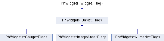
Contains flags for Widget resources. More...
#include <Widget.h>
Classes | |
| struct | Anchor |
| Contains flags for Widget resource Widget::Arguments::AnchorFlags. More... | |
| struct | Cursor |
| Contains flags for Widget resource Widget::Arguments::CursorType. More... | |
| struct | Extended |
| Contains flags for Widget resource Widget::Arguments<>::ExtendedFlags. More... | |
| struct | Resize |
| Contains flags for Widget resource Widget::Arguments::Resiztype. More... | |
Public Types | |
| enum | type { AllButtons , Autohighlight , Blocked , CallbacksActive , Clear , ClipHighlight , Damaged , DamageFamily , DelayRealize , Destroyed , FocusRender , GetsFocus , Ghost , Highlighted , InFlux , Menuable , MenuButton , Obscured , Opaque , Procreated , Realized , Realizing , Region , Selectable , SelectNoredraw , Set , Toggle , WidgetRebuild , WidgetResize } |
| Common flags for Widget resource Widget::Arguments::Flags. More... | |
Detailed Description
Contains flags for Widget resources.
Member Enumeration Documentation
◆ type
Common flags for Widget resource Widget::Arguments::Flags.
Common flags used by all widgets. Except for those indicated as read-only, these flags are all read/write.
Aliases
PhWidgets::Widget::Flags::type
| Enumerator | |
|---|---|
| AllButtons | Any pointer button can activate the widget. Default is the left button only. |
| Autohighlight | Highlight and give focus to the widget when the cursor enters its extent, and unhighlight and remove focus when the cursor leaves. |
| Blocked | Prevent the widget and all its non-window-class children from interacting with Photon events. |
| CallbacksActive | If certain widgets have this bit set, and your application sets their resources, the relevant callbacks are invoked. Otherwise callbacks aren't invoked when your application sets resources.
|
| Clear | (read-only) The widget's brothers-in-front don't intersect with its extent. |
| ClipHighlight | Clip the corners of the highlighting rectangle. |
| Damaged | (read-only) The Widget requires repair. |
| DamageFamily | (read-only) The widget and all its children need to be repaired. |
| DelayRealize | Prevent the widget from becoming realized unless it's explicitly realized with Widget::Realized event. |
| Destroyed | (read-only) The widget has been marked for destruction. |
| FocusRender | Render a focus indicator when the widget when it gets focus. |
| GetsFocus | Allow the widget to be granted focus. The widget needs to have this bit set if it's to receive key events. |
| Ghost | Dim the widget. Setting this flag doesn't affect the widget's behavior, just its appearance. The simplest way to disable the widget is to set the Blocked flag in this resource. |
| Highlighted | Allow the widget to be highlighted as defined by the Widget::BevelWidth, and the Basic::BasicFlags. |
| InFlux | (read-only) A call to PtContainerHold() has been made on the widget. |
| Menuable | Respond to clicks on the pointer's right button (i.e. enable the Basic::MenuActivate event). |
| MenuButton | The widget is a menu item. |
| Obscured | (read-only) The widget is completely covered by one other widget, or it's completely outside its parent container's canvas. |
| Opaque | (read-only) This widget obscures everything directly behind it (i.e. it isn't transparent). |
| Procreated | (read-only) The widget was created by another widget (as opposed to an application), such as the List and Text created by a ComboBox. |
| Realized | (read-only) The widget is realized. |
| Realizing | (read-only) The widget is in the process of being realized. |
| Region | Force the widget to have a region. |
| Selectable | You can select (repeat, arm, disarm and activate) the widget. Widgets usually provide visual feedback when selected. |
| SelectNoredraw | The widget doesn't change its appearance when set or unset. This is meaningful only when the widget is Selectable. |
| Set | The widget is in a set state. Generally, this indicates that the widget has been selected. |
| Toggle | Pressing the pointer button on this widget causes it to toggle between being set and unset.
|
| WidgetRebuild | (read-only) The widget will be rebuilt(rerealized) when the widget engine is finished applying resource changes. |
| WidgetResize | (read-only) The widget will be resized when the widget engine is finished applying resource changes. |
The documentation for this struct was generated from the following file:
- src/Widget.h